
Bloom: A Product Design Case Study
Designing a web app from scratch that communities wanted to pay $1,500 for.
**Disclaimer: This article is mainly a product design case study, but I’ll be approaching this case study from my perspective as an entrepreneur. This isn’t just a concept, this is the story of the genesis of a real product with a viable business strategy behind it.
My responsibilities:
- Defining site structure
- Testing site structure through wireframes
- Designing interactions and visuals for the entire website
- Documenting components with a design system
- Building a landing page to market our product to clients
My tools:
- Google Docs
- Miro
- Notion
- Figma
- Maze.co
- Webflow
A quick backstory.
This venture started during the summer before my junior year at Cornell (summer 2019). My good friend, Rami, was working on an app idea for the Black and Latino students at Cornell; he recruited me onto his team as a product designer. After some hardcore evaluation and critique, we decided to start over from scratch. This meant that I was no longer just his product designer- I became a co-founder. His entrepreneurial spirit rubbed off on me and I began thinking about this idea as less of a side project and more as an actual business. The idea eventually evolved into a peer-to-peer matching service that we piloted with a community called ColorStack the following summer (summer 2020).
That part of the story isn’t what I’ll be focusing on during this case study. Instead, I’m going to take you through the process of building our product into something that we could actually sell to community managers.
What do community managers need?

“I like what you guys are doing for my members, but to be honest, I have more pressing needs for this community,” Jehron said.
“Well? What are they?” Rami replied enthusiastically.
It was the end of the summer, and we had finished running our pilot with the ColorStack community. We were matching people within that community to other members who had similar interests/hobbies/career goals weekly for virtual coffee chats (see figure above). The people who met their matches were very satisfied with their conversations and rated our service highly.
But we had a problem. Fewer people were actually opting in to our service than we originally hoped. If we couldn’t get the community members to use our platform, then we couldn’t get community managers to take us seriously. It was clear: not enough community members were willing to meet each other virtually to make our product viable. We needed something new.
“I host my community on Slack, but I’m using a whole bunch of other tools too. New members sign up for our community through our website, I manage my member information with Airtable, I send emails with Mailchimp, I’m hosting my events with Zoom and Eventbrite, and on top of that, we’re about to launch a Notion page to centralize knowledge for all of our members,” Jehron told us. “I’m using way too many tools to do one job: run my community.”
Rami and I ran communities ourselves, and Jehron’s rant struck a chord with us. We’ve experienced the very decentralization that he was talking about. We ran communities on Slack, and we also ended up adding more tools to our stack. Each of these tools had way more features than we needed and, as a result, were harder to use because they weren’t built for communities.
So we formed a hypothesis:
Community managers like Jehron are willing to trade their other tools for a platform built specifically for member-focused communities.
Let’s hop into the design process.
**The entirety of this project was carried out virtually. All brainstorming and whiteboarding sessions took place over a Zoom call. Miro and Figma are both great collaborative tools when you and your team are not collocated.
Scope: our minimal viable product.
Based on our experience, we expected our target customers to be non-profit communities such as professional help networks and college organizations such as frats and alumni networks. We also had access to community managers of these organizations in our immediate networks, so we decided to interview them.
We identified trends in goals that community managers of these organizations had:
1. They want to use as few platforms as possible to manage the community.
2. They want to prevent disconnectedness between members and increase engagement.
3. They want to track membership activity.
4. They want to allow members to easily network with each other.
5. They want something that is easy to understand for people who aren’t technologically savvy.
In order to help communities achieve the first and second goals, we’d need to centralize the core functionality of the tools they currently use into one platform. In other words, we need some form of the following:
- Membership management
- Event hosting
- Payment processing
We kept the third and fourth goals in mind, and we needed to make our UI as simple as possible in order to address the fifth goal.
We wanted a collection of features that would be feasible to design and develop within a 6 month time span, but would still achieve the goals of community managers.
We talked to our potential customers again, discussed with each other, and settled on the following feature list:

**For sake of simplicity, I’m not going to cover our customer research in depth here. We spoke to customers regularly throughout our process of building this platform. Articulating all our methods and insights would be too lengthy of a discussion. If you’d like to hear more about our research process, feel free to reach out.
Structure: IA and user flows.
With a feature set this broad, it was especially important that we spent a lot of time and effort on developing a strong information architecture. This way, Rami and I could be on the same page about site structure. I’m a designer and Rami is a developer. So if we wanted to build efficiently, we needed to make sure that Rami was involved in all parts of the design process.
Market Research
While the initial feature set we were building was more focused on the administrative side, we knew that our long term goal for the platform was a full community hosting platform. So instead of drawing inspiration from CRMs like Airtable and Salesforce, we looked at current community hosting platforms.
We surveyed the market to see what kinds of solutions exist that achieve similar goals. We then took a look at how these platforms structured their content. We also looked at how Slack structured its content.

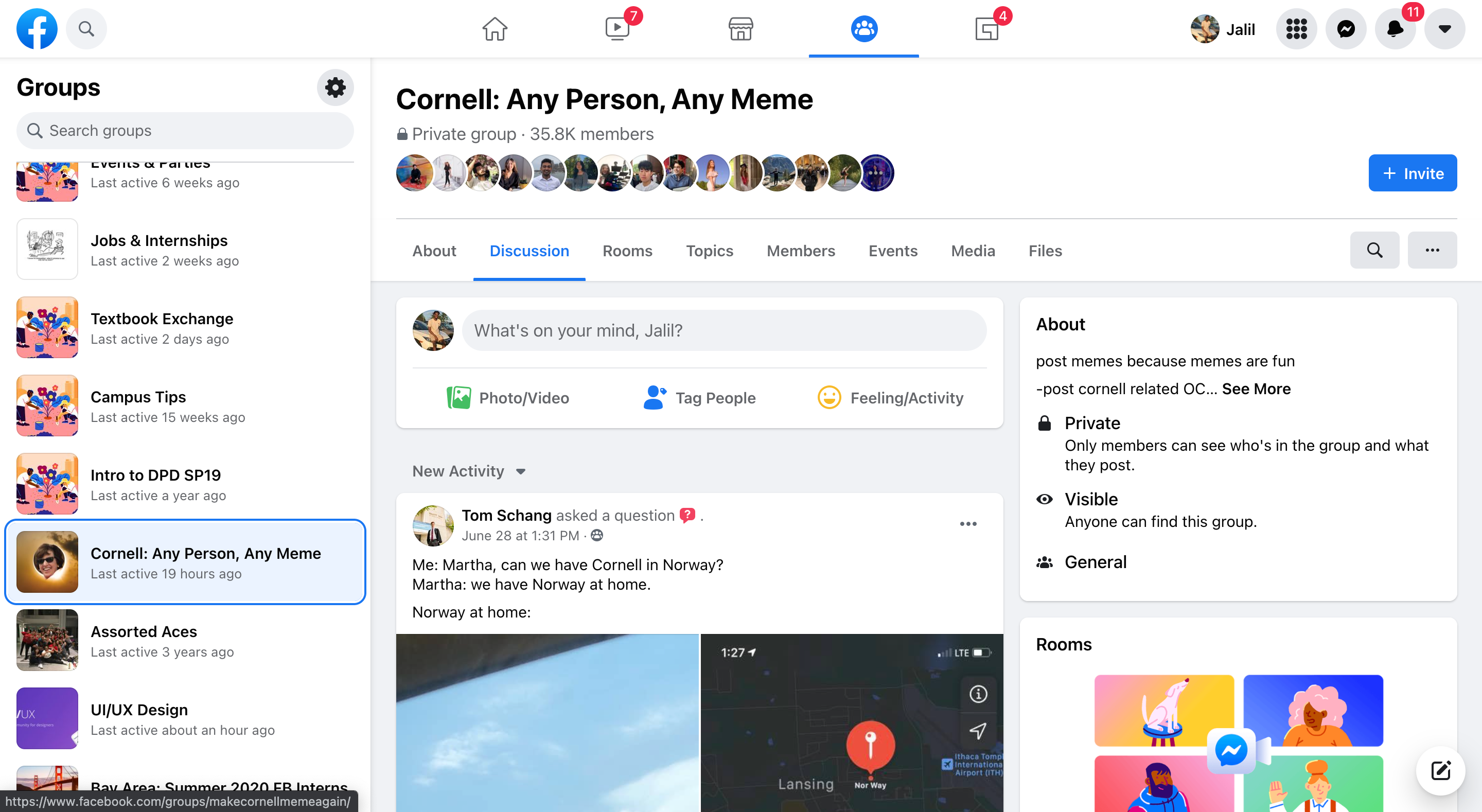


We found that:
- All of these platforms utilize a sidebar navigation (maybe because there’s a lot of equally important content).
- Facebook and Slack use the sidebar to show different communities the user is a part of.
- Facebook uses a header navigation.
Creating our information architecture.
We listed out all the tasks we wanted our users to be able to accomplish on our platform. Then we drew out user flows of what we assumed to be the simplest way to accomplish these tasks (See figure below for an example.)

As we were building our user flows, we realized a key constraint that we needed to keep in mind: Every community is different. The information that each community will want to collect on their members will vary. (A career focused organization might care more about career goals, but a dance focused organization might care more about favorite dance styles.) So we need to keep our content structure general enough that it can be adapted to fit many communities.
With the user flows in mind, we followed the following steps to create our information architecture.
Step 1: We inventoried our content on Notion (What needs to go on the platform to make our features usable?)
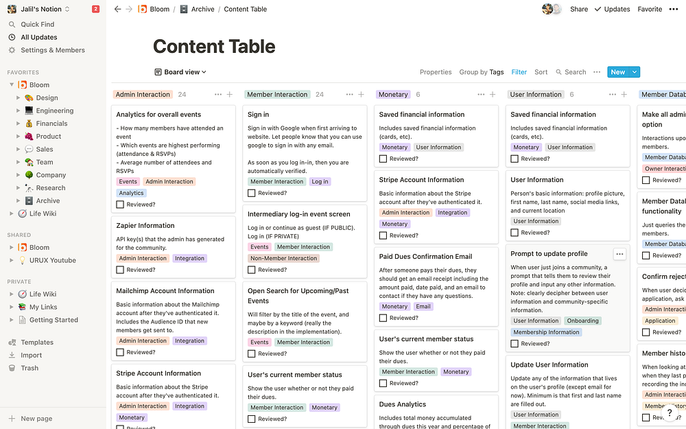
Step 2: We took our content and did some card sorting to establish a logical structure. (We took a screenshot for every single content card on our Notion and moved it over to our Miro board. I can still hear the screenshot sounds today 😣)

Step 3: We grouped our sorted content into specific pages.

Step 4: We connected our pages with arrows and labels that showed how users get from one page to the next in the context of their tasks.

This process took about two and a half weeks to complete. There were a lot of meetings and a lot of debates! But it’s a worthwhile process because you and your team come out with a shared understanding of the problem space and product structure. This will allow all your future work with your developer to be a lot smoother and productive.
Creating an IA (information architecture) seems like a big and daunting task, but it isn’t so bad when you take it one step at a time. Check out this website for an in-depth explanation of IA and how to create your own!
Wireframes & User Testing
With our information architecture complete, I went ahead and put together some wireframes reflecting our information architecture. The goal here was to get some quick customer feedback on the usability of our navigation and page structure.

I used Figma to connect these pages together in a prototype before using Maze.co to create a virtual user testing session that I could share with potential customers. Here’s a demo that shows you how to use Maze for your user testing.
We had the tester take the perspective of a manager of a fake community. Here are some tasks that we had them do:
- Find the member database
- Add a new member to the community
- Enable the Zoom integration
- Join the event that’s happening right now
- RSVP for a future event
We didn’t find any significant usability issues with our navigation and content structure, so we moved on to designing our platform in high fidelity.
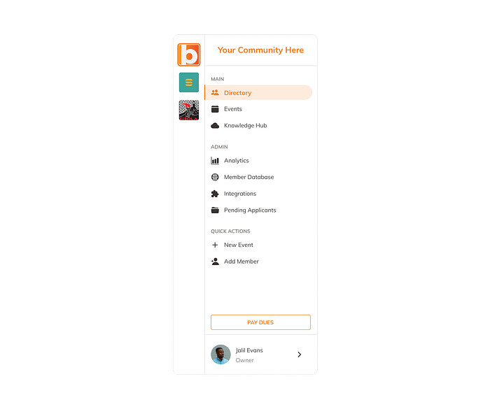
Visual considerations
Before we started designing in high fidelity, there were a couple things we needed to keep in mind:
- Adaptable color scheme. We understood that community managers were passionate about their brand. So we needed to make our color scheme adaptable to any community brand. To do this, we used HSL values for our colors instead of RGB. With HSL, we could let the community owner select the Hue that they wanted. I only needed to play around with the saturation and lightness values to create an accessible and aesthetic monochromatic color scheme.
- Limit Bloom branding. Since this platform is meant to feel like whatever community we design for, we wanted to limit placing our own logos and brand assets in the platform.
High fidelity explorations.
**This is nowhere near an exhaustive list of all the design explorations I did. However, I felt it would be valuable to highlight a few situations where I had to make educated design decisions. To make things simple, I’ll focus on the member database.
By this point, it was approaching December 2020. We had scheduled our launch date for March 2021, so we only had 4 months to design and develop the entire feature set we outlined earlier. This meant that we didn’t have time to reinvent the wheel. Our plan was to draw inspiration from similar solutions that worked and adapt it to our use case.
We created a workflow based on features. I designed a specific feature (e.g. Member Database), and then Rami developed that specific feature. As Rami developed, I would be working on the designs for the next feature and remain on call for any questions he had about the feature he was working on. Usually, I was finished designing the next feature around the same time Rami finished developing the previous feature. This let us work efficiently in parallel and not waste any time.
The member database is a page that the managers of a community can use. It allows managers to view information on all the members of the community. They can also filter the database to perform actions on certain demographics of members. For example, they could send an email to all the women interested in product management.
The challenge: how might we design a database that is easily scannable, filterable, provides detailed information, and makes it easy for managers to perform quick actions on members?
I drew inspiration from Gmail, Notion, and Dribbble designs for my explorations.
Filter

Here’s what the member database looks like. The filter is on the right side above the table. There’s a lot of data that community managers want to collect on their members. However, many managers don’t have a way to send a targeted email to any subset of the members. This is where the filter comes in handy. We wanted managers to quickly filter members based on any piece of data they collect.
Exploration #1
This is the first exploration: filters are grouped by category, and users can click on a filter option to apply it. If there are a lot of options in a filter (over 5), then the options are searchable.

All the options are immediately visible on this version of the filter. However, it can become very long as the community owner collects more information, and this can result in information overload. The options also just look like plain text. They don’t look very clickable.
Exploration #2
This exploration is inspired by Notion’s filter mechanism. The user selects 3 fields. The first field is the filter category, the second field is the comparison type, and the last field is the option you are filtering on. The option type adapts based on the filter category that you select.

The pros of this filter is that it preserves a lot of screen space, increases flexibility, and it would be easier to develop. The cons are that the filter options are not immediately visible, so it will require more familiarity with the data to use effectively.
Exploration #3
This filter acts very similarly to Exploration 2, but instead displays all the filter categories as an expandable list.

The categories are immediately visible on this filter, so it requires less familiarity to use effectively. It can also deal with more information more effectively than the first exploration. The downside to this filter is that it would be harder to develop.
Selections
How might we convey our hover states and select states to effectively give the user feedback on their interactions with the database table?

We ended up going with Exploration 3. This was inspired by Gmail’s material design.
Action button placement
The member database has multiple actions associated with it. Managers should be able to select one or many members to do any of the following actions: copy email address, export member data, promote to admin, or remove from the community.
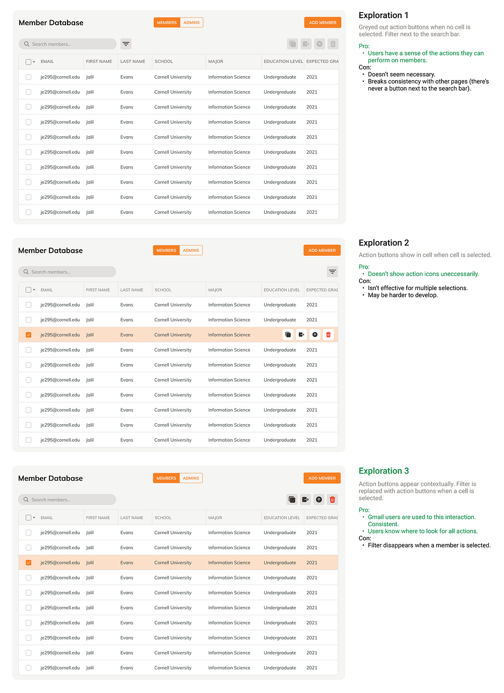
We went with Exploration 3 to develop. After studying Gmail’s table design and looking through a couple Behance projects, I learned that many products make use of contextual actions (ones that only appear when they might be relevant). So the filter is most relevant before you make a selection. Once you make a selection, the actions you can perform on a member are the most relevant.
Design system.
One of the biggest issues I had when working with my developer was a lack of consistent design components. Because we were rushing through the design process, I frequently made components that served similar purposes but looked different from each other. One of the most important aspects of a quality UX is consistency. Every page on the platform should look like it belongs on the platform. So in order to make sure we reused components when possible, and that we could communicate effectively with one shared vocabulary, I created a style guide (design system). Here are the elements below.
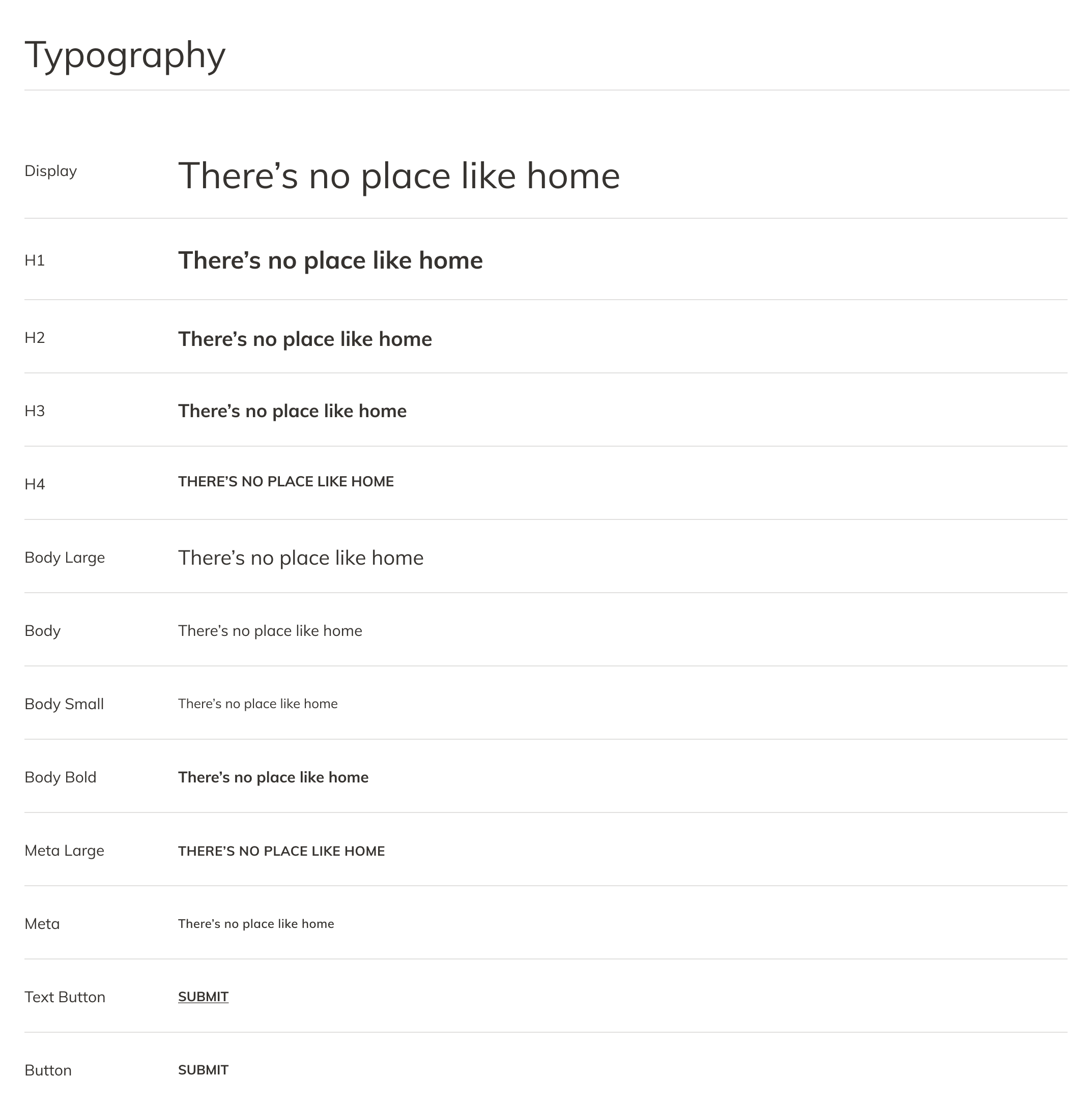


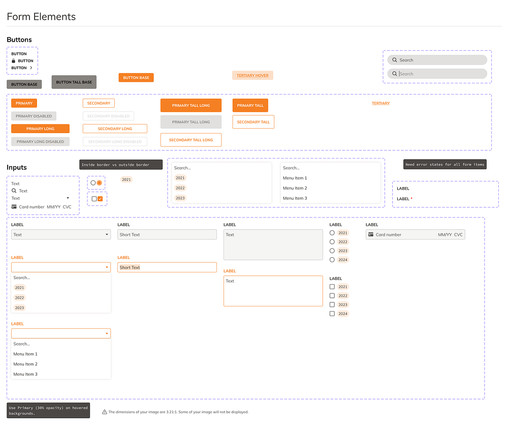
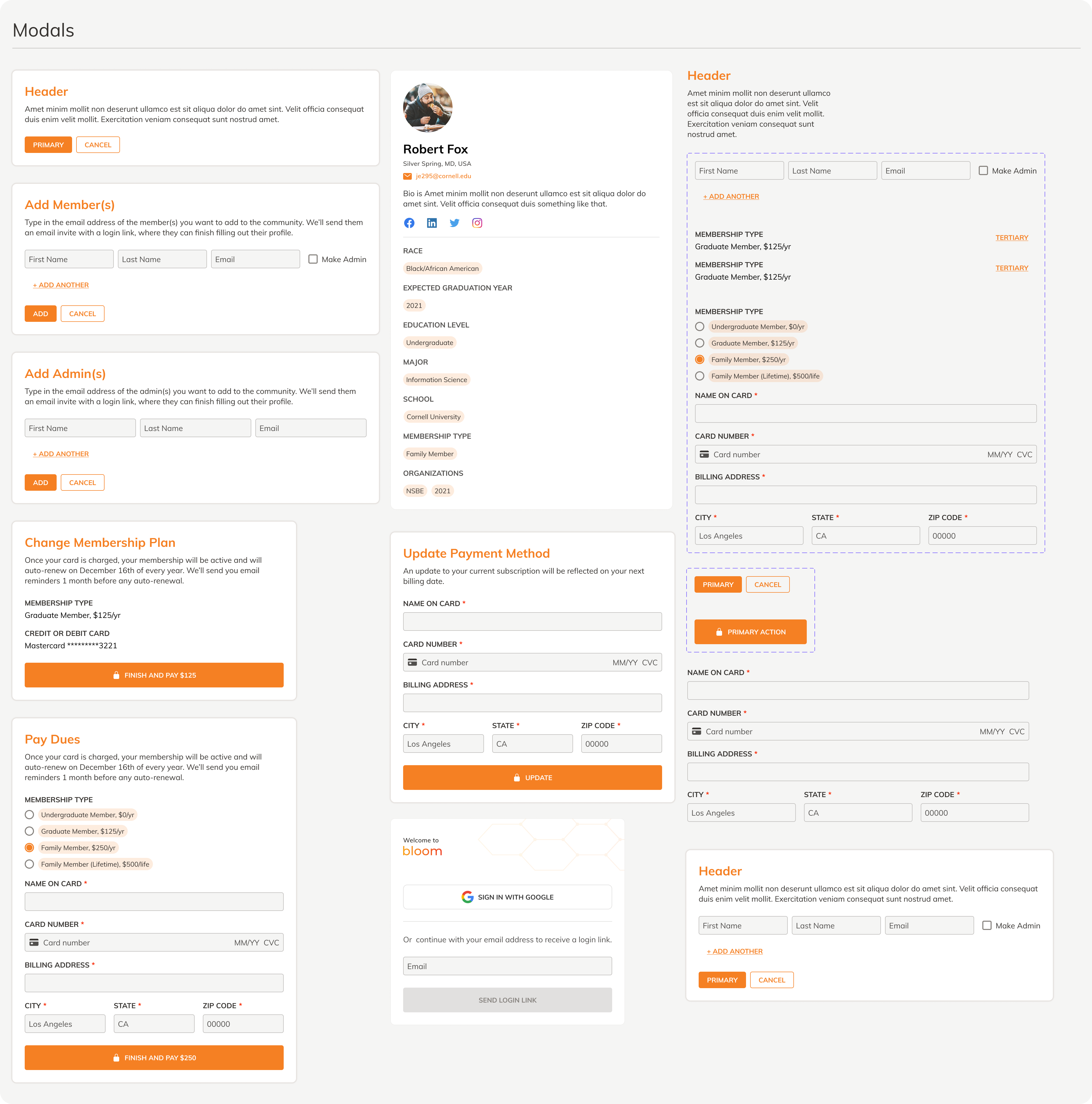


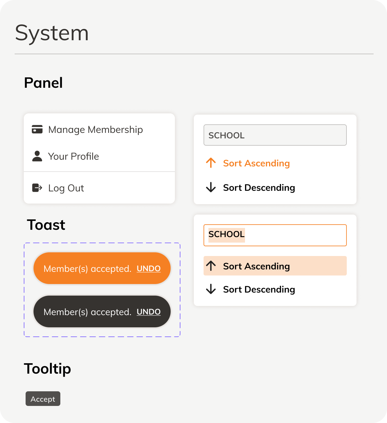
It took about 2 weeks to finish the design system. But similar to the information architecture, the workflow between my developer and I benefitted immensely. This even allowed my developer to make quick changes on the fly by utilizing the components we already built and documented. Check out this Youtube series if you want to learn how to create your own design system on Figma.
Final prototype.
There were some last minute changes that we made on the fly. For example, we added quick filters that managers will typically want to use. We also added celebratory tags to members who subscribed to the highest tier payment plan. Once you have a strong relationship with your developer, extensive documentation of designs isn’t necessary. In the early stages of a startup, the goal is to just figure out what works and what doesn’t.
Putting it all together.
We finished developing our platform in March. So I built a landing page using Webflow that highlighted the pain points that our platform solves. My co-founder posted the landing page on Twitter and it got mad love ❤️ . Check out the landing page here!
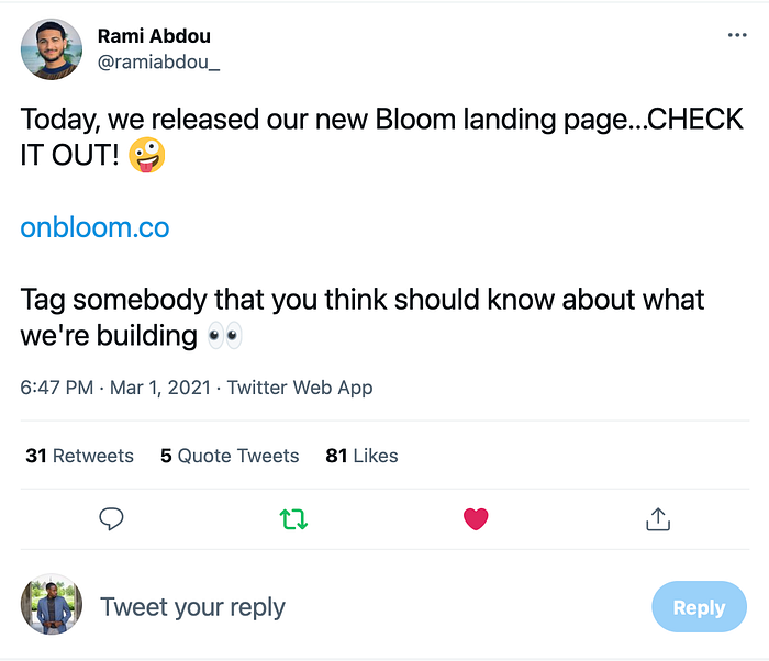
About 25 community managers reached out to us to schedule a demo with us. We were overwhelmed with the amount of positive reactions our platform was getting! We were working through getting contracts signed, and we finalized a contract with ColorStack for $1,500 yearly.
Unfortunately, we decided not to continue pursuing the Bloom venture. We gained a lot of wisdom, and we both learned a lot of new skills. However, with both of us having graduated from college, we felt it was time to start the next chapter in our lives.
With that being said, if you made it this far, thank you for reading my article! I’m Jalil Evans, a product designer based in the DMV. I’m currently looking for new employment opportunities. So if you found this article resourceful, give it a clap. It helps this article get viewed by more people!
If you’d like to connect, or want to place your bets on the NBA finals (I got the Suns), reach out to my email at evansjalil49@gmail.com.
Peace ✌🏾
